

What is a pivot table? It is a feature in MS Excel made to help organize and condense complex-to-understand data. The pivot table is best for finding patterns appearing in the data matrix being processed and brings out trends and relationships in the data, enabling the user to present key aspects of information in a more meaningful way.
Pivot tables allow us to summarize and analyze numerical data. We can group and total data, explore details behind the totals, and create neat and visually appealing reports. They are particularly useful for comparing data, analyzing trends, and drawing insights from complex datasets, such as sales data or financial data. Pivot tables work by reorganizing and summarizing data without altering the original dataset, making data analysis more efficient and insightful.
Users can choose which data to include in the pivot table and can specify the rows, columns, and values that they want to see. This allows users to customize the pivot table to meet their specific needs and goals.
So reiterating the purpose of pivot tables: calculate, summarize, and analyze data in Excel. It helps you see comparisons, patterns, and trends within your dataset. Hence the keywords #Organize and #Summarize.
Let’s assume, for demonstration’s sake, that we have an e-commerce store with customers from some major countries in the world. Our website gathers the data in a spreadsheet in downloadable form. In the scenario, we have order id, customer names, products category, purchased products, product price, quantity, order date, country and city columns in the downloaded file. To get useful insights, we start with a sizable dataset (typically tabular) and build a pivot table.
We can either do this stuff by manually putting in formulas and functions, or use pivot tables and let excel do the heavy lifting. Here, Pivot Tables come in handy and allow us to: Group data by different criteria (e.g., sales by region, products by category); Summarize values (e.g., total sales, average scores); filter, sort, and rearrange data dynamically.

The sample dataset for the pivot table exercise uploaded at the above link for convenience. In the next step, we want to analyze a few points in the information to better understand your business position. This will help us in our decision making in the future and direct the business into a more desired state.
Creating a Pivot table: Basic Steps
Select the data range (ensure it’s organized in columns with headers). Go to the Insert tab and click Pivot table. Choose where to place the Pivot table (new sheet or existing sheet). Drag fields (columns) into the Rows, Columns, and Values areas to build the summary table.
Now the next step would be to identify patterns for further decision making. Suppose we want to find out what country and city is giving us the most sales so that we can devote a CSR team to provide seamless customer service for that area.
Place the cursor on a cell of the table, go to the Insert tab and click on Recommended Pivot Tables. Excel will suggest pivot tables with different calculations for your ease. Either choose from the list or we can click the pivot table and start from scratch.

As seen above, the Sum of price by country is a very simple table which can help identify which country is giving the most sales. Choosing this will open a pivot table in a new sheet for editing. Here’s what happens. Excel rearranges the country column inputs into row labels and then adds up the values in the price column and presented the results in a single cell in the Sum of price column. See below:
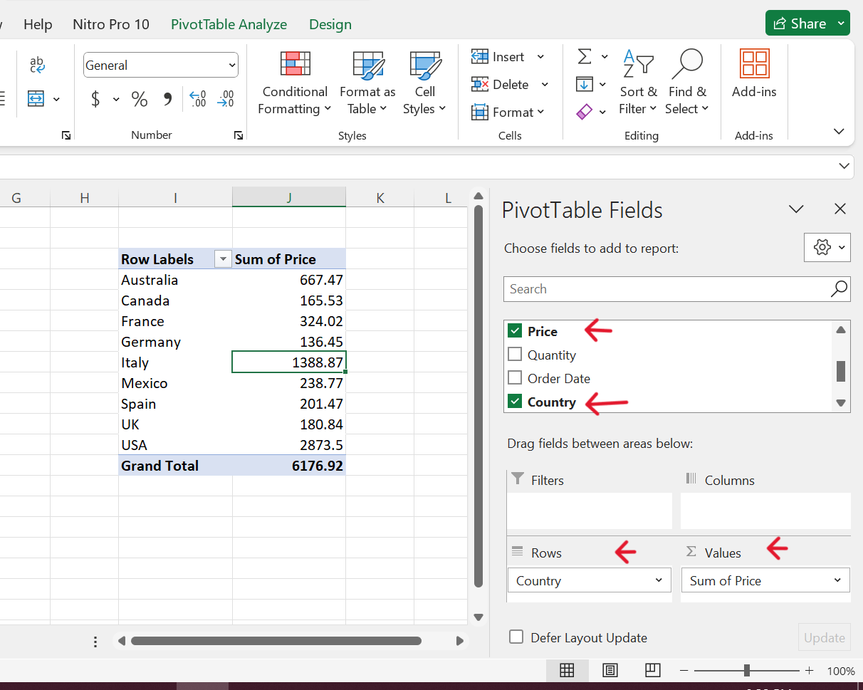
Note that we have the option to calculate prices manually using other formulas, like SUMIF. However, here the Pivot table is performing the action for us. If we want to see country and city wise data, we can drag the city field into the rows and so on as per requirement.
Editing Pivot Tables
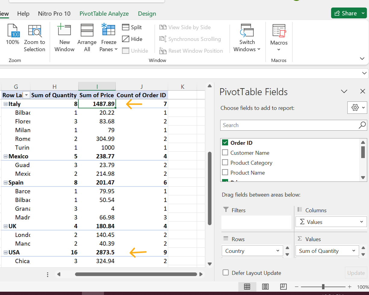
Based on the table, it might seem that the USA is giving us the most business, however to determine other aspects, we might need to know how many items are being sold in Italy to give the total price amount. For this, we can drag “Quantity” into the values field and choose SUM in functions (when selected in values area). Subsequently, we move the order id and quantity columns from the dataset to the values area, for calculating the sum of quantity and count of order.

Next, we adjust the prices of products in Italy (which were mistakenly put before) and recreate the pivot table. This time we see that the sum of price divided by the sum of quantity is higher for Italy than that for the USA, meaning Italy may have more potential for quality product sales.
From the above brief example, we can infer that Excel’s pivot table function empowers users to explore, analyze, and summarize huge datasets with ease. It helps in presenting data in a user-friendly way, filtering, grouping, sorting, and conditionally formatting subsets of data, and rotating rows to columns or vice versa (pivoting) to view different summaries of the source data.
For effective pivot tables: organize data in columns (not rows), ensure all columns have headers, use clean, tabular data for best results, format your data as an Excel table, and consider using Power Query for complex data transformations.
Hope this helps!
